 R in 3 Months
Data Viz Exercise | Yamhill Income
Instructions
Your job is to fill in the blanks in the code below to recreate this visualization:
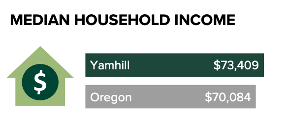
A couple notes:
- The house icon was added outside of R. Don’t worry about adding it.
- The colors you can use to get close to the viz are “darkgreen” and “gray”
- Don’t worry about adding the Median Household Income title
This is part of Oregon by the Numbers.
Playground 🛝
Here is the dataset that we’re using:
Solution
ggplot(
  data = median_income_yamhill,
  aes(
    x = amount,
    y = geography,
    label = amount_formatted,
    fill = geography
  )
) +
  geom_col(show.legend = FALSE) +
  geom_text(
    color = "white",
    hjust = 1.2
  ) +
  geom_text(
    aes(
      x = 10000,
      label = geography
    ),
    color = "white"
  ) +
  scale_fill_manual(
    values = c(
      "gray",
      "darkgreen"
    )
  ) +
  theme_void()